Showing posts with label Recession. Show all posts

Friday, 1 February 2013

Miscellanea

The objective of this post is to provide our readers with a quick update on the markets we have covered thus far, while waiting for our next major post, which will cover the precious metals market.

Stocks

The S&P 500 has advanced less than 4% since our post on the coming bear market, but judging from the bullish noises made by various pundits and commentators you’d tell it has doubled. CNBC has even put on their screens a “countdown window” measuring the distance between the current Dow level and the all time highs.
From a fundamental perspective, the recent data releases have confirmed what we’ve long been thinking: the global economy is at best growing at a very mild pace, but most likely it is in the first phases of a contraction. Europe is undoubtedly in a recession, no matter how desperately talking heads try to positively spin the data: the recent Markit PMIs were supposedly a success, since the pace of contraction eased a little…big deal! Not to mention the fact that France is falling fast into the grave Monsieur Hollande has been so busy digging since coming to power. European retail sales were also disastrous (no surprise here for those who understand the specular concepts of overconsumption during the boom periods and forced savings during the bust). China is showing a lacklustre “recovery” (we’d prefer to call it: “short-lived rebound artificially engineered by means of inflation”), as evidenced by the latest PMI readings. Japan continues to be stuck in a recession, with the only difference being that now companies face additional pressures on their margins, given that a weaker Yen has pushed up their input costs, while their output prices continue to fall amid strong competition and a lack of demand for their products: they can of course thank Shinzo Ape (no, it’s not a typo) for this one. The US economy is also sending more than a few warning signals (and we are not referring to the meaningless GDP) and is in desperate need of a recession to correct and liquidate all the malinvestments engendered by the Mad-Hatter-in-chief Bernanke. It seems likely to us that much of the positive surprises in data recently released are due to the already high and recently accelerating rate of inflation, which furthers the aforementioned malinvestments. Moreover, earnings and revenue growth have at least stalled, but our suspicion is that they’ve started reverting to the mean: after all, many companies have issued negative guidance, either for the year or the quarter.
Technically, the stock market remains very overbought and ripe for a correction. Bullish sentiment and complacency have reached new extremes and many sentiment and positioning measures are now well into their danger zones (e.g. NAAIM Survey, Investor Intelligence, AAII, Rydex Fund flows and positioning, Hulbert Survey etc.). In short: the retail investor is back, eagerly waiting to get fleeced again.
We’re willing to make a wager here: we think that the actual top is less than 5% away (i.e. we think the S&P won’t surpass 1575, much to the chagrin of CNBC). Timing-wise, the prediction is a more difficult one to make: we may be two weeks or two months away from a top. It will all depend on how the stock market behaves: given that it’s already very overbought, if it were to rise fast towards the all-time highs, it’d probably mean a top is in; however, if it were to correct a little and then resume it’s advance, then we’d be looking at a longer topping process that could drag out until March or April. In any case these are just exercises in futility: what really matters is that we are convinced a top is near and we’re committed to the short side, as this is were the best risk/return proposition lies. To all the bulls pressing us to buy we can only say: “After you, my dear Alphonse”.

Yen

This is were things really get interesting! The Yen is as oversold as it has ever been, with e.g. the EURJPY cross stretched more than 22% above it’s 200-day simple moving average, something almost unheard of for a major currency pair like the EURJPY, which only happened before during the 2008 panic, for strong fundamental reasons to boot. But we’ve discovered a little something that might turn the bears dreams into nightmares… We’ve already commented about the usual strategy employed by the BoJ (to say a lot and then do a little) and it appears that this time they’ve really surpassed themselves!
The details are as follows: the BoJ recently announced ¥13 trillion of monthly purchases of JGBs and T-Bills starting in 2014, but what has apparently gone unnoticed to the hordes of excited bears is that these purchases are gross (i.e. they include rollovers, that is purchases made to reinvest the proceeds of redeemed securities). Net purchases (which are made with newly printed money), on the other hand, won’t amount to more than ¥10 trillion per year, that is more than 10 times less than advertised (as a basis for comparison, consider that current monthly purchases amount to ¥3 trillion).
Now this is a remarkable sleight of hand! They’ve fooled pretty much everybody into thinking they’re going kamikaze, when in reality they’re going to print one tenth of what they claimed and one third of what they already print. We think that such an achievement might warrant an entry in the Urban Dictionary: “to pull off a Japanese”. Derren Brown stands in awe.
Of course market participants can continue to ignore reality for longer than it appears humanly possible, nonetheless with sentiment in the dumps, more and more stories pointing to the resurgence of the carry trade and extreme CoT readings we remain convinced that the Yen is going to revert to the mean and then some. It appears increasingly likely, though, that this will happen in concomitance with the decline of the stock market, exactly as in 2007: patience is advised.

Softs

Sugar is behaving in a rather bullish manner: after washing out some more weak hands with a new low on 23/01, it immediately reversed up on huge volume and then proceeded to play a new trick on bulls, staging a high-volume reversal to the downside on 29/01 and then going through a very volatile range on 30/01, before resuming its march higher over the next two days before closing the week on a mixed note. Price now sits right just below the 19c$ level and the 50-day simple moving average and both have acted as strong resistance in the past. We suspect however that an upside breakout is imminent, not least because the recent CoT reports showed commercials going net long for the first time since 2007. Sentiment remains subdued, increasing the likelihood of positive surprises.
Coffee on the other hand is showing weaker behaviour: after an initial follow-through from its break out level, it plunged right back to the 50-day moving average and then after a couple of days moved below it. It now stands again just below this key average, with favourable sentiment and CoT readings. We continue to remain bullish, but this latest development forces us to consider the possibility that the bottoming process is not yet finished and that as such further volatile spikes and corrections could occur.

Monday, 21 January 2013

The Yen: a Contrarian’s Wet Dream


The objective of this post is to clearly delineate the reasons behind our recent Yen bullishness and to explain why we think buying it against the Australian and New Zealand dollars is likely to prove a very profitable and relatively safe speculation. We need however to immediately point out that everything we are going to write below is conditional upon the Bank of Japan continuing to do what it has always done (and what we think is likely to continue to do), namely to say one thing and then do another (or slowly do just a little of that one thing). In case the demented Abe is capable of fully enforcing his delirious inflationary views on the BoJ, then dear readers brace yourselves and prepare for the Misesian “disastrous bull market”… This is the main reason why we advocate implementing the trade with a judicious use of call options on the Yen (or put options on the Aussie and Kiwi), as they both buy us time and protect us from unwanted catastrophic scenarios that, although unlikely, could nonetheless materialize. With the above in mind, let’s begin our analysis.

The Fundamental Backdrop

A) Japan’s Money Supply growth is both modest and lower than that of other major currency blocks

Leaving aside temporary phenomena which might impact it, the long-term value of a currency is mainly determined by its supply and demand dynamics: in the end it will tend towards the level where demand and supply converge. So the main question an investor has to ask himself is: what is the current supply/demand status quo and how it is likely to be impacted by future developments?
We won’t cover here all the factors influencing the demand side, apart from briefly mentioning that during periods of economic turmoil society’s reservation demand for money (see Rothbard, “Man, Economy and State with Power and Markets” - Chap. 11) tends to sharply increase (as a reflection of the increased uncertainty market participants face). Of course such demand will tend to focus on those forms of money which, correctly or not, market participants perceive to be of highest quality. This is the formal explanation behind the safe haven trade and the reason why during the last crisis the Yen and the Dollar benefited handsomely at the expense of other, less trusted, currencies like the Euro. We will instead focus on the supply side.

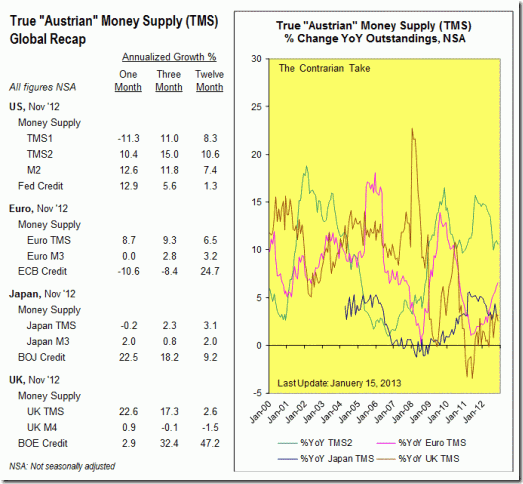
TMSComparison
Japan’s True Austrian Money Supply as calculated by Michael Pollaro at The Contrarian Take.

As can be seen in the chart above, sourced from the highly recommended blog of Michael Pollaro, Japan’s True Austrian Money Supply growth has been muted in recent years (readers interested in learning what this money supply measure contains and why, as well as in which respect it differs from commonly used metrics like M1 and M2, can do so here and here). Even more importantly, given that currencies do not trade in a vacuum but rather against each other, it has been consistently lower than those of other important currency blocks like the U.S., the Euro area and the U.K (not shown in the chart above and yet important to mention is the fact that BoJ’s credit has only recently reached its old 2005 peak, whilst other central banks have tripled, quadrupled or even quintupled their credit since the beginning of the financial crisis).
There are two main reasons as to why this has been (and may well continue to be) the case: on the one hand, the BoJ has been reluctant in injecting large doses of newly created money into the economy, notwithstanding all their posturing; on the other hand Japanese banks have been more than happy to grab the chance to engage in massive deleveraging (a.k.a. credit contraction), thus counterbalancing to a large extent the effect of money printing (it should be noted here that inflation is correctly defined as an increase in the supply of money and money substitutes). Going forward, the second factor is likely to remain unaltered, given that the sorry state of the Japanese economy and the increasing likelihood of a globalized slowdown mean that banks are probably going to be unwilling to extend new credit (please see chart below). So the question becomes whether the BoJ will truly print enough to overcome the deflationary effect of credit contraction and to outdo its competitors in the mindless race to devalue (on this last point please see our paragraph below). We are inclined to think that much of what we’ve heard so far is little more than political manoeuvring and that in the end they won’t seriously alter the status quo lest they may finally wreck the ship, given that Japan’s precarious position does not allow much if any room for “funny money” experiments. The BoJ’s meeting this week will give us some clues as to the likely direction they’ll take, although the actual implementation of their programs is what matters most.

japan-loans-to-private-sector
A chart showing first the decline and then the almost non-existent growth of credit in Japan, via http://www.tradingeconomics.com/.

We recommend our readers to have a look at all of Michael Pollaro’s charts on Japan’s True Austrian Money Supply as well as his work on other currency blocks. We also suggest reading this WSJ article, in which the author points out that Abe’s inflationist policies might upset some powerful sectors of the business establishment (not to mention many other innocent people as well as the poor chaps at the bottom of the economic ladder, who always suffer the most from such insanity). Incidentally, this has so far been the only mainstream article we have been able to find which didn’t contain gloomy predictions about the Yen’s imminent demise and which didn’t simply regurgitate some expert’s opinion about why shorting the Yen is going to be the greatest thing since sliced bread…

B) Other Countries are unlikely to let themselves be outprinted by the BoJ

We have already mentioned the fact that so far the BoJ has shown remarkable temperance in its money printing (and that other central banks have not), but should they decidedly change course, what are other countries going to do? Are they going to let themselves be “outprinted” by these latecomers in the inflation game? On this topic we can do no better than pointing our readers to this excellent article written by the always excellent Pater Tenebrarum, which closely mirrors our own views and even includes a nice haiku for the discerning reader. It appears clear to us that the fallacious and highly damaging mercantilist approach is going to be embraced (or has already been embraced) by most nations, thus making any devaluation attempt on the part of the BoJ unlikely to succeed (particularly if half-hearted).

C) The influence of Capital Repatriation (i.e. carry trade and Japanese overseas investments)

This point analyses in more detail one of those temporary phenomena which might impact the value of a currency: the sudden shift of large amounts of capital from one currency block to another. As we have already witnessed during 2008, when a serious, unexpected crisis strikes, massive quantities of money, which previously headed, during the course of many months or even years, in a certain way, are quickly moved back in the opposite direction, thus causing extremely powerful trends in the currency cross involved. This can be likened to the effect that suddenly opening the floodgates of a large dam has on the underlying brook.
In the case of the Japanese Yen, we think there are at least two factors which might contribute to this phenomenon materializing: the infamous carry trade and the repatriation of foreign holdings on the part of Japanese investors.
The former is certainly no longer as large as it once used to be, both because many speculators got badly burned during its 2008 dramatic unwind and because the spread amongst yields has been steadily diminishing. However, the fact that the hunt for yield has become even more desperate and the stable if mild uptrend which many risk currencies (like the AUD or the NZD) enjoyed against the Yen since the post-crisis rebound of 2009 might have induced at least a modest resurgence of this phenomenon. A generally low level of forex volatility that reached its apex during last summer probably also played an encouraging role. It’s important to note that this is only speculation on our part, as we do not have any concrete evidence to back our claims.
The latter factor, on the other hand, has in our opinion the potential to generate the kind of outsized forex move we’re looking forward to. Japanese investors hold a staggering $3.3 trillion of foreign assets, which amounts to roughly 55% of their annual GDP. The Ministry of Finance holds approximately $1.27 trillion in exchange reserves, whilst the remaining $2 trillion are held by the private sector. During a crisis, either out of fear or out of necessity, some of these holdings are liquidated and the proceeds repatriated: this has an obvious boosting effect on the Yen. This is exactly what happened during the spring/summer of 2011: both the massive earthquake that shattered Japan in March and the mini bear market that shook global markets during the summer induced capital flight and thus generated a quite powerful rally in the Yen, which took place notwithstanding a globalized manipulative effort to the contrary on the part of the G-7 (which was capable only of producing a temporary spike in late March of 2011). We expect this to happen again, only on a much larger scale, during the coming bear market.
As to why we chose Australia and New Zealand as the main counterparties to our long Yen campaign (apart from the specific reasons outlined in the paragraph below), please consider the following: roughly 80% of Australian government bonds and 70% of Australian corporate bonds are owned by foreign investors (sources here and here); the situation in New Zealand in not much different, with 62% of government securities now held by foreigners. We suspect this is going to have a huge negative impact on their currencies in case of a global crisis. The icing on the cake is that Japan’s investments in Australia total more than $123 billion and account for 6% of all foreign investments in the country (placing Japan firmly in the third place, behind the U.S. and the U.K.). Almost half of this sum is invested in Aussie bonds, in a desperate hunt for yield. There are signs that this phenomenon is accompanied by dangerously high levels of complacency and euphoria ("If you think there's been a lot of investment from Japan in Australia so far, just you wait and see," Mr Beazley said. "The Australian economy looks and feels extremely secure."). Finally, the traditionally risk-averse Japanese individual investors have recently started to become excited about the U.S. and other foreign equity markets, exactly at a time when caution would be advised.

D) A Brief Introduction to the Australian Bubble

We will now briefly cover the main reasons which stand behind our calling Australia a bubble.

1. Brisk monetary growth, both in absolute terms and when compared to other countries:

M1Index
The hallmark of all bubbles: monetary growth. M1 in Australia, the U.S. and Japan, indexed at 100 in January 2005.

M1Comparison
A long-term chart showing the annual percentage changes in M1 for the same three countries. Australia has often led the way.

It appears clear from the charts above that there has been remarkable inflation going on in Australia for at least two full decades and we know that with inflation malinvestments and capital consumption inevitably occur. Japan on the other hand has certainly been the least bad of the group, something which we already remarked above [Ed. Note: since we do not have True Money Supply statistics for Australia, we are using M1, which acts as a decent proxy.].

2. Large amounts of debt, mainly concentrated in the household sector:

HouseholdDebt
Household debt as a percentage of GDP: higher than in the U.S.

Australian households are buried in debt: if the economy barely sneezes, they’ll get pneumonia. In this context, it’s worth nothing that the latest PMI reading (December 2012) came in at 44.3, marking the 10th consecutive month of contraction, and that the overall picture painted by the report is rather bleak: interested readers can find more info here.

3. The always-present real estate bubble:

Global house prices_ Clicks and mortar _ The Economist
House prices in Australia, U.K., Canada, Spain, Japan and the U.S. via The Economist.

HousingGlobalPropertyGuide
Year over Year % change in real estate prices in Australia, via Global Property Guide.

It’s quite obvious that there’s a massive property bubble in Australia. Other indicators looking at affordability (namely price to income and price to rent ratios) also signal massive overvaluation. Mortgages account for a large part of the astronomically high household debt [Ed. Note: readers can find some interesting info here. We also think that the whole blog is worth keeping an eye on.]. When will this bubble pop, as they all inevitably do? We wouldn’t rule out it’s already in the process of deflating, given that we’ve had two years in a row of declining prices (recall how in the U.S. prices topped in 2005, roughly two to three years prior to the actual bust) accompanied by declining sales in both the residential [Ed. Note: forget the mindless babbling of the article’s author and instead just focus on the chart at the top of the page.] and commercial sectors. Moreover, point 4 below might prove to be the prick that this floating balloon needs so badly.

4. Australia’s fate is highly dependent on China:

Exports to China constitute roughly 29% of all Australian exports, with Iron Ore accounting for more than half of the total, with Coal, Gold and Oil distant followers (all data sourced here). It’s not difficult to envision what would happened in case the much-talked-about Chinese hard landing materialized. As a side note, we’re highly sceptical of the Chinese boom as well, given that it’s built on the shaky foundations of money and credit inflation, coupled with massive state intervention in the economy (which all result in malinvestments and capital consumption). Curious readers could embark on their own research on the topic: we’ll just mention that ghost cities are amongst our favourite manifestations of the massive misallocations and imbalances currently plaguing China, mercantilist extraordinaire.

Technicals, Sentiment and Positioning

From a technical perspective, the Yen is severely oversold and incredibly stretched below its long-term moving averages (like e.g. the 200-day simple moving average):

yen
A chart showing the Japanese Yen Index, via http://stockcharts.com/.

It’s important to note that the index above tracks the movements of the Yen against a basket of currencies and that the levels reached against certain currencies (like e.g. the Euro, the AUD, the MXN and the NZD) are even more extreme.

JY
Yapanese Yen Futures Positioning, via http://www.cotpricecharts.com/.

Positioning in the futures market is also remarkably elevated, with small speculators holding a record amount of shorts and large speculators’ shorts at a multi-year high (significantly higher levels were recorded during the summer of 2007, right at the peak of an egregious bubble and at a time when the carry trade was still buoyant). It’s worth mentioning that this is accompanied by opposite extremes in AUD and MXN positioning, thus showing a propensity toward risk-taking and generalized complacency. We briefly mention here that record CoT readings in risk-on and risk-off currencies usually provide very reliable contrary signals on the stock market as well.
Finally, sentiment on the Yen lies at multi-year (possibly all-time) lows, with Sentimentrader’s Public Opinion Survey showing only 16.5% of bulls, after having spent quite some time in the below-neutrality zone. Moreover, the Yen is universally hated: we have yet to see somebody who is not bearish on it. Pundits and talking-heads as well as many self-appointed experts have all been quick to point out how the currency is doomed, how shorting it is going to be the best trade of 2013 (when in fact it most likely was one of the best trades of 2012...), how the BoJ will inflate ad infinitum etc. As the heading of one of our favourite blogs reads: "When it's obvious to the public, it's obviously wrong."
The conclusion is clear: rarely have we seen such extremes and they have never proved to be the hallmark of a sustainable trend.
Moreover, an investor has always to ask himself: what is the market already discounting? It appears to us that in this specific case the market has already priced in many negative developments, some real some most likely not, leaving ample space for positive surprises.

Conclusion

We are very bullish on the Yen and we are convinced that the best way to position ourselves is to buy it against fundamentally weak currencies like the Aussie Dollar. The important caveat is that the mental Abe could really wreak havoc on the country and consequently on its currency, given that Japan truly is just a little inflation away from total disaster. We always prompt our readers to engage in their own research. In our next post, we’ll discuss how secular bull markets generally end and which common traits they tend to share at such a juncture: as you’ll see, the Yen currently displays none of them.

Addendum

The BoJ set a 2% inflation target and embraced open-ended asset purchases: we have to confess that we are rather pleased to see this outcome, given that on the one hand it deprives the hallucinated Abe of the possibility to attack the Bank and on the other it gives the Bank itself the flexibility to decide how much and when to print (whereas a fixed monetary goal would have forced them to act and would have always elicited calls to "do more"). Moreover, there wouldn't be any additional money printing until 2014. We'll now have to watch like hawks how this new program is implemented (and whether the appointment of the new BoJ governor in April will change the landscape significantly), as this is what really matters: should the BoJ really print ad infinitum, then it would be game over; should they decide to continue to deliver only a modicum of money printing now and then, as they've always done, then the secular Yen bull market should resume its advance. So far the market's reaction gives us cause for optimism: at least a short to medium term rebound is likely in the cards, as too many jumped too quickly on the short yen boat.

Tuesday, 8 January 2013

2013: The Comeback of the Stock Bear


A brief introduction to our secular perspective

The purpose of this first post is not to give an in-depth look at market history or to discuss at length what the long-term macro picture is likely to be, but rather to provide a sound analysis of the current market situation. However, in order to better contextualize  said analysis, we feel it’s important to make our readers aware of what our secular perspective is.
We are of the opinion that a secular bear market in equities started in March 2000 (this opinion is probably shared by anybody who has not lived under a rock during the course of the last decade). Secular bear markets tend to last on average approximately 17 years and at their secular bottoms they tend to reach certain specific and depressed valuation levels which in turn give rise to new secular bull markets. As we shall endeavour to demonstrate during the course of this post, such depressed valuations levels have not only not yet been reached, but not even approximated. This, the fact that according to historical records we still have some 5 years or so to go and certain macroeconomic considerations (a succinct summary of which you’ll find in the next paragraph) lead us to believe that we still remain mired in a secular bear market.
Secular bear markets all display certain characteristics, one of which is the alternation of cyclical bear markets with cyclical bull markets. During the current secular bear, we’ve witnessed two cyclical bears, followed by two cyclical bulls, the last of which is the current one. Historical precedent tells us that we should expect at the very least another cyclical bear market, more likely two.
With that in mind, let’s see why we think we may be on the verge of one of those nasty cyclical bears, but not before having covered some basic economic theory.

The money printing fallacy

“But the Fed will not allow the stock market to plunge”, “With all this money printing stock prices are bound to increase”, “QE(insert number) is stimulating the economy and putting it back on track”, we can almost hear the sceptics say. So let’s quickly deconstruct these arguments and show why money printing (these days euphemistically called Quantitative Easing in Newspeak) is not helpful to the economy at all and, as an obvious consequence, ultimately hurts stock prices as well (even in extreme situations, when money printing goes berserk à la Zimbabwe, stocks fail to make any real advances, i.e. they fall when measured against gold). To all the readers brave enough to venture on their own in the realm of macroeconomic theory we suggest to read the important classics of the Austrian School of Economics, like “The Theory of Money and Credit” and the intimidating “Human Action” by Ludwig Von Mises and “Man, Economy and State with Power and Market” by our beloved Murray Rothbard. We strongly encourage all the other readers, who do not have this somewhat masochistic vocation or simply lack the time to engage in such in-depth readings, to visit Pater Tenebrarum’s blog Acting Man: there he provides a very useful and always excellent commentary on the economy and markets and in our opinion does a great job at simplifying and summarizing rather complex concepts in a clear and concise way.
What is money? Money is the general medium of exchange, the thing that all other goods and services are traded for, the final payment for such goods and services on the market (Rothbard, Austrian Definitions of the Supply of Money). Is money synonym with capital? No, capital represents the so-called “pool of real funding”, it is saved consumption (i.e. lower order goods) which can be used to fund investments in higher order goods (e.g. new plants, machinery etc.) with the goal of increasing productivity and achieving economic progress (i.e. doing more with less). All investments have to be funded with capital (that is: real resources that were saved before and that are now taken out from the economy’s pool of real funding to sustain the investments). Money alone does not suffice. However the fact that capital is often expressed in terms of money constitutes the basis for a pernicious misidentification.
What do money printing or the expansion of fractionally reserved bank credit do to the economy? Because of the public’s conflation of money with capital, they fool economic actors into believing that there is more capital available than it’s actually the case. They encourage investments in higher order goods that appear sustainable when they really aren’t (because the economy has the money/credit, but doesn’t have the actual real resources to fund such investments that this money/credit purportedly represents). The longer this shell game continues, the more capital is wasted in the process, further reducing the pool of real funding and thus undermining the economy as well as its future prospects. Sooner or later reality sets in and all the endeavours that appeared to be profitable because of this fictitious  abundance of capital are revealed for what they truly are: malinvestments that need to be liquidated. This happened many times before (inter alia 1929, 1965, 2000, 2007) and is happening again now:

HigherOrder-LowerOrdervsSP500_03-01-2013
The ratio of Industrial Production of Business Equipment to Industrial Production of Nondurable Consumer Goods and the S&P500 index (right scale, logarithmic). The  graphical demonstration of our point: all unsustainable fiat money-driven spikes in the ratio of higher order to lower order goods need to be painfully corrected. Notice the strong correlation of such corrections with bear markets. It is important to note that Corporate CAPEX has been extremely high as well as of recent: not really a bullish sign.

As such, money printing cannot achieve what it should supposedly achieve, namely to bring about economic prosperity. What it can achieve is to delay the inevitable and, in so doing, make it worse.
With these objections now out of the way, let’s get down to business.

Fundamental Conditions

In this section we intend to show you why in our opinion a new cyclical bear market is likely just around the corner. We will cover two main points: the current stage of the business cycle and the current level of stock valuations as well as the rationale behind them.
A) Where we are in the Business Cycle
A premise: there are plenty of indicators out there which track (or supposedly track) economic trends and we are well aware that not all of them confirm what we are about to show below. However if a recession were obvious no profit opportunity would currently exist. Moreover some of those indicators aren’t in our opinion reliable, as they’re either lagging rather than leading or they’re based on shaky theoretical foundations. Generally speaking we tend to favour indicators which track the performance of the manufacturing sector, as it represents the core of economic activity. We also tend to dislike indicators based on GDP or GDP growth, as we’re not at all fans of this specific aggregate (and of economic aggregates in general), although now and then we do employ it to calculate ratios (and will do so below). We may some day write a more theoretical post on the many weaknesses of GDP and other popular indicators, but for now this will suffice. Of course we encourage our readers to do their own research on the topic. Finally, although we’ll only show US data below, we’d like to briefly mention that the December Markit manufacturing PMIs came in as follows: JPM Global 50.2 (up from 49.6 in November: back in slightly positive territory after a few months of contraction); Eurozone 46.1 (down from 46.2 in November: still no end in sight for the 18-month-and-running contraction); Germany 46 (down from 46.8 in November: in contraction mode since March 2012 with 18 months of falling orders…anybody wants some DAX futures?); Japan 45 (down from 46.5 in November and currently sitting at a 44-month low, with investment goods demand contracting the most).
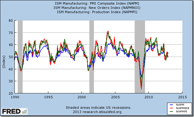
The first chart we show in this section tracks the performance of three popular indicators published by the Institute for Supply Management: the New Orders Index, the PMI Composite and the Production Index. They generally tend to be leading indicators, although to varying degrees, with the New Orders Index being our favourite one.

ISMMix_04-01-2013
PMI Composite, New Orders and Production Index: their ability to anticipate recessions can be clearly gauged from this graph.

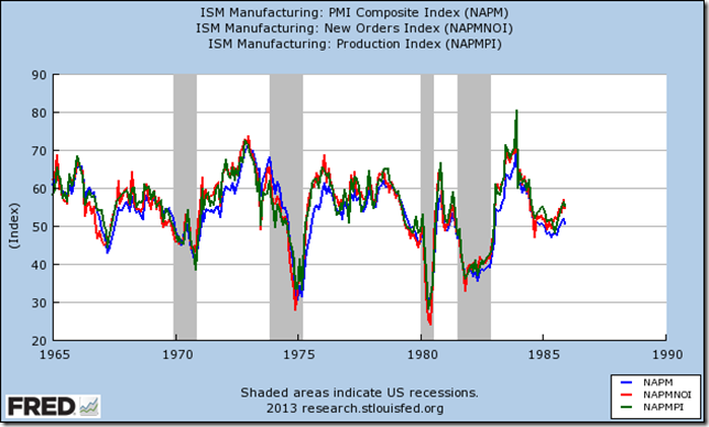
As can be seen above, all these three indicators have been flirting with contraction territory for quite some time (remember that a reading above 50 signals expansion, whilst one below indicates contraction; the same applies to the Markit PMIs further above). Sceptics may point out the undeniable fact that these aren’t infallible measures, as they often give false signals, as in the period from 1990 to 2000. However one always has to contextualize information: back then we were in the second decade of a very powerful secular bull market, whilst right now we find ourselves in the second decade of an equally powerful secular bear market. To further prove this point, let’s see how this indicator fared during the last secular bear market (1965-1982 or 1967-1982 depending on interpretations):

fredgraph
Same indicators as above, from 1965 to 1985.

It becomes clear that false signals become way less frequent, particularly as the economy enters the tail end of the secular  bear cycle. Our contention is that we are today in a very similar situation: we are approaching the final and always more painful years of a secular contraction which, as we must never forget, was born out of an egregious bubble of unmatched magnitude.
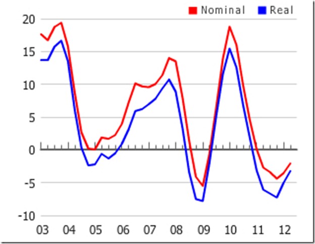
The second chart tracks the evolution of an indicator known as Smoothed US Recession Probabilities, which was created by economists Marcelle Chauvet and Jeremy Piger. Readers interested in exploring how this indicator is constructed and its workings can do so here. It is important to note that the indicator undoubtedly confirms a recession after it has long happened: if one wants to profit from its use one has to act in a sort of “twilight zone” of uncertainty (as is always the case in financial markets as well as in life in general). It is also worth mentioning that, given the way in which it is calculated, it is published with a delay of roughly two months (i.e. the last reading currently available refers to the month of October): this adds an element of uncertainty as well (one has to act early or risk “missing the train” as two mere months can induce a lot of change in the  markets). With that in mind, let’s see what it tells us:

RecProb_04-01-2013
Smoothed US Recession Probabilities: the last reading refers to the month of October and came in at 7.34%.

We can notice a quite unpleasant spike in recession probabilities as of late. The last readings were as follows: July 0.6%; August 4.5%; September 4.8%; October 7.3%. Clearly, the trend so far is up and the rate of change tends to be quite dramatic, i.e. we are unlikely to see a quiet and progressive increase: this stems from the fact that recessions tend to happen quite abruptly. False signals are rare: the only one worth mentioning happened during late 2005. The two spikes recorded in the  late ‘70s were soon followed by the 1980 recession. So the question becomes: is this recent increase likely to be a false signal? You decide! But we’d tend to think it’s not.
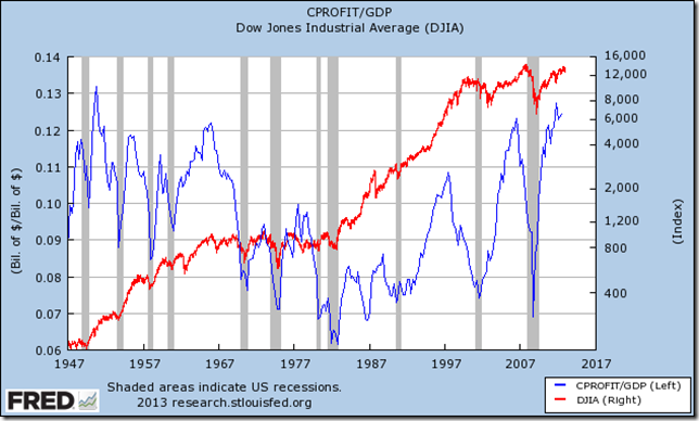
Finally we’d like to include a chart which shows Corporate Profits with Inventory Valuation Adjustment and Capital Consumption Adjustment as a percentage of GDP, with the Dow Jones Industrial Average superimposed (right scale, logarithmic) :

CorporateProfits%GDPvsDOW_01-01-2013
Corporate profits as a percentage of GDP: currently at nosebleed levels and they got there with an astonishing vertical rise to boot! Notice how during bear markets peaks in the ratio tend to anticipate important tops in the stock market.

We can make two important observations with regard to the graph above. Firstly, Corporate Profits currently are at very high levels relative to GDP, when viewed in an historical context. This makes us think that further economic expansion seems improbable at this stage, since this is exactly what we've already got for the last four years and corporations have benefited handsomely: does this look sustainable? Secondly, the correlation between this ratio and stock prices tends to be rather weak during secular bull markets and strengthens during secular bear markets: this might be explained with the fact that during secular declines profit margins as a whole tend to be more dependent on the economic cycle, as it frequently and dramatically swings from expansion to contraction, whilst during secular advances they are influenced by a wider array of factors and recessions tend to be less frequent, milder and only temporary. Not surprisingly, the ratio usually peaks before the stock market does and as of now it has apparently topped already: are we going to see this relationship continue? Keep in mind that since the start of the current cyclical bull market in 2009 Corporate Profits growth has been impressive and is unlikely to continue on this path: mean reversion appears to be a more probable outcome, hence further upside in the ratio above should be capped.
These considerations, as well as many other and maybe more conventional ones which we won’t cover here, have us thinking that a major turn for the worse in the business cycle is likely to happen fairly soon. Chances are, it may have happened already and its effects are going to become evident during the course of Q1 and Q2 2013.
B) Equities are Overvalued
Although deteriorating economic conditions are a necessary factor in provoking a bear market, they are by no means sufficient: we also need to have generous and overly optimistic stock valuations. Something we’re apparently getting as well! Before proceeding with the analysis, we’d like to acknowledge the excellent work done on this topic by HussmanFunds in their Weekly Market Comments. We were recently involved in a discussion on equity markets at one of our favourite blogs: a reader argued, somewhat bizarrely, that HussmandFunds’ lacklustre performance somehow disproves the validity of their research. As any real trader or investor knows, doing great analysis and employing it profitably are two very different things (by coincidence, their latest missive thoroughly and convincingly addresses this criticism and explains their long-term strategy as well as its basis). We are of the opinion that their work is not only interesting, but more importantly rooted in actual facts and sound arithmetic calculations. We also recommend our readers to have a look at the valuation research of Doug Short as well as at his other work: we do not always share his views, but he always makes for an interesting and thought-provoking read. We will present below a selection of charts from these two sources.
The first graph plots a number of valuation metrics against their arithmetic mean (for the record, Doug Short also shows the same metrics compared to their geometric mean) and the distance between the CPI-adjusted S&P Composite and its exponential regression line:

valuation-indicators-arithmetic
Crestmont P/E, Cyclically Adjusted P/E (CAPE 10) and Q Ratio compared to their arithmetic mean and the distance between the CPI-adjusted S&P Composite and its exponential  regression line. For the sake of brevity, we’ll leave it to the interested reader to investigate the details of these valuation measures and their validity or lack thereof. More information can be found here, here, here and…here!

It appears evident that a) the overvaluation levels reached in 2000 were egregious, whilst those reached both in 2007 and presently look quite scary as well(in fact the ‘60s bull market peaked at or below those levels); b) neither in 2002 nor in 2009 did we reach the levels of undervaluation usually associated with secular bear market bottoms (actually we didn’t even come close to those levels) and considering the overshooting to the upside of Y2K we wouldn’t be surprised to see an equivalent one to the downside. An important caveat is that of course such undervaluation levels do not necessarily have to be achieved by means of a collapse in nominal stock prices (1970s bear market docet).
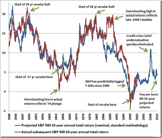
So let’s now see what kind of nominal returns can an investor reasonably expect in the current valuation environment:

HussmanProjected Returns_01-01-2103
S&P500 Projected 10-year total annual return in nominal terms(details on the calculation method here) and the subsequent 10-year total annual return in nominal terms actually achieved by the index.

SP50010yrReturnMix_01-01-2013
The same projections made using different valuations methods and the actual subsequent return. Extracted from this article.

As can be gauged from the charts above, the 10-year total nominal return a prudent investor (one who does not recklessly gamble in hope of finding the proverbial greater fool) should be expecting based on current valuations lies somewhere around 5% per annum. Historically, this is where  bull markets tended to peak, rather than bear markets bottom: the latter occurred when prospective total annual nominal returns where around 20%. Buyers beware!
It should be remembered that these generous valuations arrive at a time when earnings/corporate profit margins have likely peaked (earnings growth has already been decelerating for quite a while and has recently turned negative during Q3 2012, as reported by Factset).

Technicals, Sentiment and Positioning

The final section of this post will cover a variety of timing tools which we find useful in helping us assess the likelihood that a major market turning point is approaching. Again, this is not meant to be a comprehensive list: we just want to show some of the more interesting and maybe some of the lesser known technical and timing indicators we use.
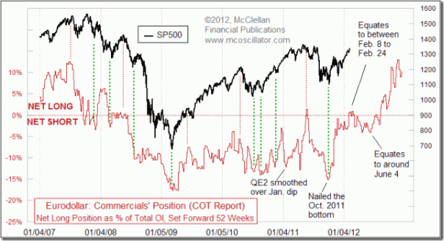
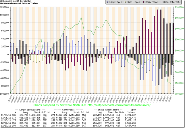
We’ll start by including a somewhat arcane technical indicator, developed by McClellan Financial Publications: the previous year’s Eurodollar Commitments of Trader Report can be used to ascertain the likely direction of the S&P500 index. For some background on why this may be the case, please read here. We’ll present the most recent chart published by McClellan and then we’ll show you the graphical representation of the 2011 and 2012 Eurodollar Commitments of Traders Report.

ED-COT_2012
Commercials’ positioning in the Eurodollar market: major tops in the S&P500 tend to occur about one year after major peaks in commercials’ net long exposure.

EDCOT_2011
Traders’ positioning in the Eurodollar market during the course of 2011 according to data from the CFTC CoT reports: commercials’ net long positioning peaked around the end of November. Chart via http://www.cotpricecharts.com/

EDCOT_2012
The same information conveyed for 2012: commercials’ net short positioning peaked around September. Chart via http://www.cotpricecharts.com/

We want to warn readers that this is by no means a perfect indicator: it can and does give false signals and even correct signals may be of the mark by a few months. However we’ve found it to be useful, particularly when one focuses only on extreme readings (like the opposite ones registered during November 2011 and September 2012). According to this tool, the stock market may have already peaked and is unlikely to find a major bottom before this autumn.
We will now show a very simple yet informative breadth measure: the percentage of S&P500 stocks above their 200-day simple moving average, with the S&P500 index superimposed:

sp500-vs-sp500-stocks-above-200d-sma-params-3y-x-x-x
The S&P500 index and the percentage of its components above their 200-day SMAs: the latter has been declining since at least the spring of 2011. Chart constructed using http://www.indexindicators.com/.

The chart above shows that the participation rate in the last major advances has been constantly declining: notwithstanding new cyclical bull market highs, today 80% of stocks are in a long-term uptrend, as opposed to more than 90% at previous major market tops. Rising prices in the face of declining participation tend to signal weakness. We are aware of the fact that other breadth measures do not support this conclusion, but we think this simple indicator does a better job at measuring the health of the market than many more complex others.
It should be noted that other important bearish divergences exist: most notably long term RSI and MACD divergences and declining volumes of trading. This all combines into a picture of deteriorating technical conditions that signals a faltering advance likely to top soon.
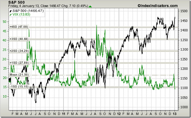
The Volatility Index confirms the assumption that we’re more likely near the end of a rally rather than at its beginning:

sp500-vs-vix-1d-sma-params-3y-x-x-x
The S&P500 Index against the VIX: volatility is currently very low and during the recent correction it has failed to show the usual behaviour generally associated with major bottoms. Chart via http://www.indexindicators.com/.

A careful look at the graph above reveals that major bottoms are usually accompanied by a meaningful spike in the VIX (at least above 30 and more likely towards 40/45). Moreover after said spikes volatility tends to remain at elevated levels for quite some time, as fear and disbelief accompany the nascent rally and every correction is mistaken for a further continuation of the downtrend. None of these circumstances where present at the recent bottom: the VIX briefly surged above 20 and immediately collapsed and currently sits at 13.8 as of Friday’s close: is this the marking of a major bottom?
Sentiment and positioning tend to confirm our bearish outlook. We won’t include any charts, as many of them are copyrighted, but we’ll instead go through a quick overview.
Sentiment: NAIIM Manager Survey, Market Vane bullish percentage and Hulbert Stocks and Nasdaq readings all stand at rather elevated levels and have been there for a while (a sign of complacency); sentiment on the Japanese yen (a classic risk-off play) currently lies at multi-year lows.
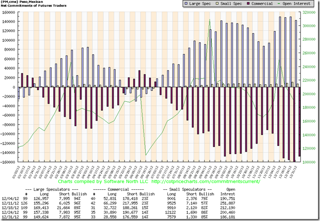
Positioning: NYSE Margin Debt is at very high levels, signalling excessive speculation; Mutual Funds Cash as a percentage of total assets and Retail Money Market Funds as a percentage of market capitalization both lie at extremely low levels, signalling complacency and an active participation in the current rally on the part of dumb money; the spread between US Treasuries and risky bonds (High Yield and Emerging Market Bonds) currently sits at very low levels, rarely seen outside of the mid 2000s bubble years; traders’ positioning in the Japanese Yen and in the Mexican Peso both stand at opposite extremes (speculators are heavily short the former and equally heavily long the latter: this is an incredibly ominous sign that never fails to materialize at important market tops). [Ed. Note: one of our next posts is likely going to cover currency markets in general and the Japanese Yen in particular, as we believe it might prove to be a wonderfully performing long in the months to come.]
We show below the graphs of traders’ positioning in the Yen and Peso, to wet the appetite of the contrarians amongst our readers (a note on CoT charts: the persistence over time of very large speculative commitments, in either direction, is always more worrying than episodic spikes):

JY
Traders’ positioning in the Yen: the last time we saw a higher commercials’ net long position was at the end of June 2007. Chart via http://www.cotpricecharts.com/.

PM
Traders’ positioning in the Mexican Peso: as far as we know commercials never held such a large net short position, at least not after 2004. Other notable extremes regularly occurred in concomitance with major stock market tops. Chart via http://www.cotpricecharts.com/.
Conclusion
We remark once again that all of the above is simply an overview (although an extensive one we believe) of the current situation and does not constitute a complete market analysis. We have however performed such an analysis and we can confidently state that it confirms the view expressed above, namely that from both a fundamental and a technical perspective we’re fast approaching an important market top that will likely signal the beginning of a new cyclical bear market of unknown magnitude (we note however that at least a test of the important support zone around 1000/1100 on the S&P500 appears likely). We can not yet ascertain whether this top has already been reached: we shall endeavour to provide a real-time update if and when we become convinced that said top is in. We do note here that this mostly concerns active short term traders: we are long-term investors and we like to establish our positions at approximate turning points, when we become convinced that a major shift in trend either has occurred or is about to occur and that consequently the potential reward of the trade dwarfs the potential risk. In this specific case, we think that it’s highly unlikely that the S&P500 will close 2013 having gained more than 10% (this is our worst case scenario), whilst the possibility of a 30% or more peak-to-trough decline appears very real. Given the above, we have started to purchase put options on major stock indices, including the S&P500 and the Dax30. We have also opened some company-specific shorts [Ed. Note: we won’t generally comment or provide coverage on single companies. To readers interested in this field, we suggest checking out the work of Reggie Middleton of BoomBustBlog fame: we subscribe to his services and are deeply satisfied with the quality of his research.]. As always, we encourage all our readers to perform their own analysis.